A visitor should be able to predict what happens after selecting a button. Labels such as Continue or Learn more can be adequate in a clear sequence, but they become vague when several unrelated options appear together. Name the destination or action closely enough that the reader does not have to click merely to discover its purpose.
For a service page, Request an estimate describes a different next step from View service areas. If both lead to the same generic contact page, explain that destination honestly. Do not label an ordinary link as Book now when no booking process exists. The wording should reflect the implemented behavior rather than the behavior planned for a future version.
The WordPress Buttons block commonly creates links styled as buttons. A real form submission or interactive action has different functional requirements. Appearance alone does not provide those functions. Check the actual destination or control behavior instead of assuming that adding a button-shaped block creates a working service.
Keep the label concise enough to scan without removing the useful distinction. Download the checklist is clearer than Click here, but a complete paragraph inside a button is difficult to read. Place supporting details nearby: file format, eligibility or what information the visitor will need next. That context should not contradict the action label.
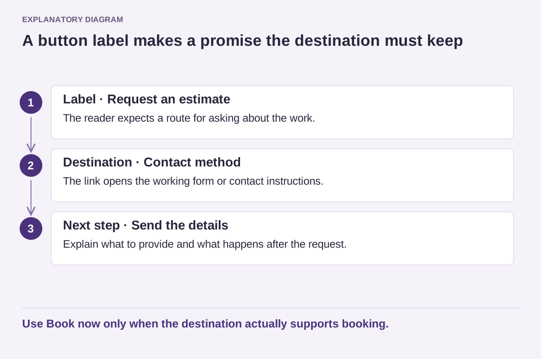
Read the diagram as text
- Label · Request an estimate: The reader expects a route for asking about the work.
- Destination · Contact method: The link opens the working form or contact instructions.
- Next step · Send the details: Explain what to provide and what happens after the request.
Use Book now only when the destination actually supports booking.
Avoid giving every link the strongest visual treatment. One main action and quieter supporting links can clarify priorities. Several equally prominent buttons compete with one another and can make a modest information page feel like an obstacle course. Let the reader finish the explanation before demanding a decision.
Test each button on the public page with a pointer, keyboard and phone where available. Confirm the destination, focus visibility and wrapping of long labels. A button that looks correct but leads to an empty page is unfinished. Good microcopy and working behavior belong together: the label makes a promise, and the destination needs to keep it.